Design should be carefully planned, adaptable, and built to last. It should create an easy-to-use, efficient, and enjoyable experience that strengthens the brand's connection with users.
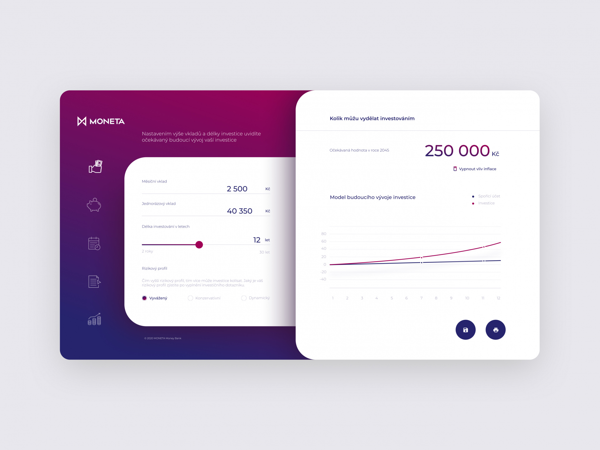
Moneta Dashboard

Lidl Strategy + Design Our team bridged the old world with the new by creating the first digital leaflet for one of Europe's largest supermarkets and significantly improving customer interaction while maintaining the original printed leaflet. In "The Story of Food," we assist customers in making informed choices when presented with information about food origin, processing, and pairing. "The Right Choice for Every Customer" includes dietary restrictions. Expert advice and social features like sharing shopping lists and recipes encourage confident purchasing decisions.
Modrá Pyramida Mobile App
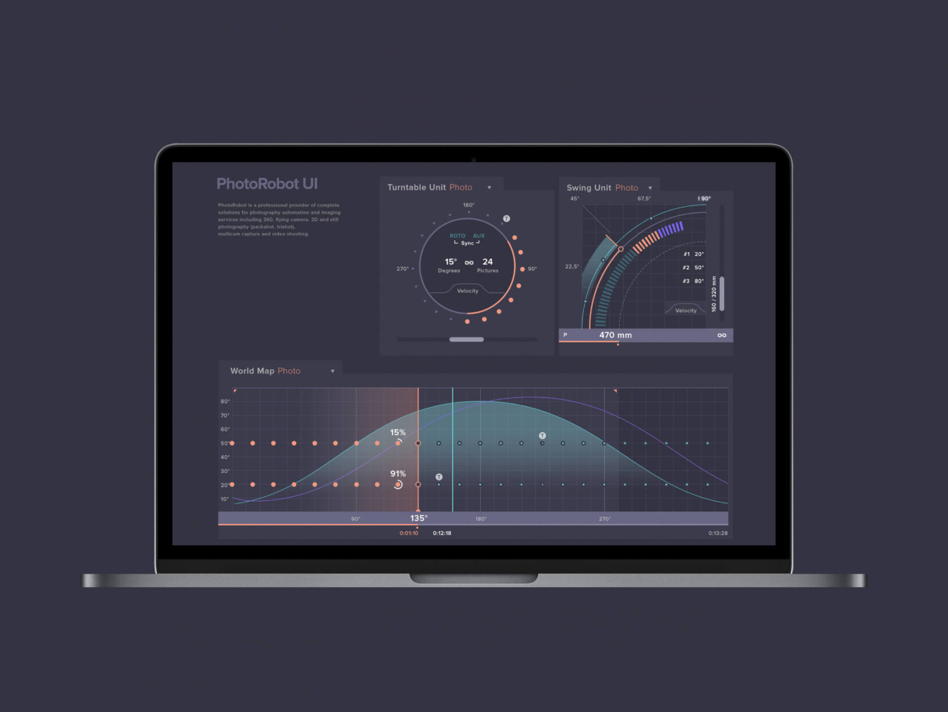
PhotoRobot Strategy + Design We created a new UI for outstanding product presentation. We completely redesigned the UI for the PhotoRobot app, which automates product image capture, cloud upload, post-processing, and online publishing. Based on stakeholder feedback, we replaced outdated number-based tables with intuitive, visual-driven features.
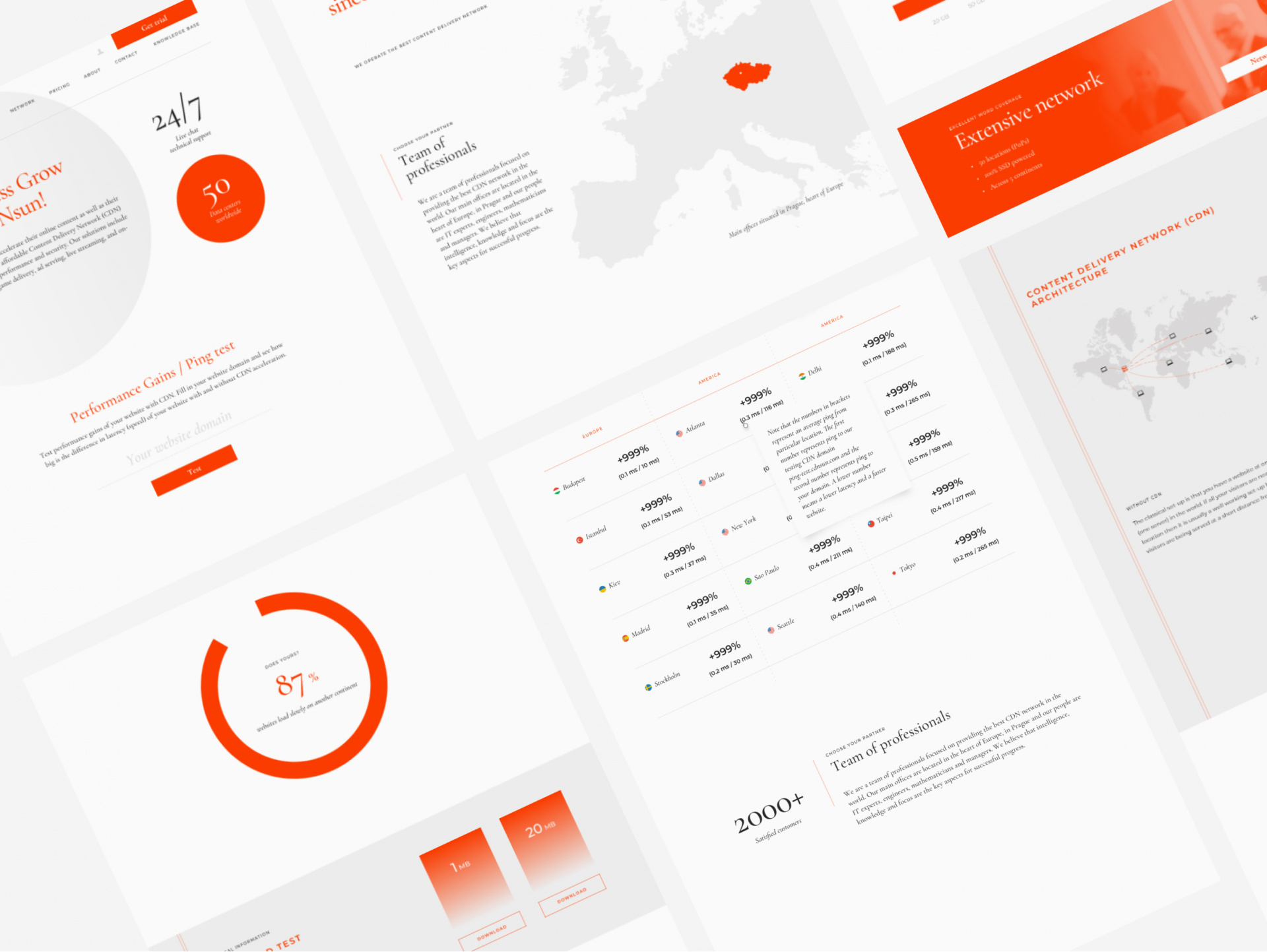
CDNsun Web & Identity For a smaller local Content Delivery Network provider we redesigned their visual identity, updated entire logotype and boosted typography to look more of a global sized company.
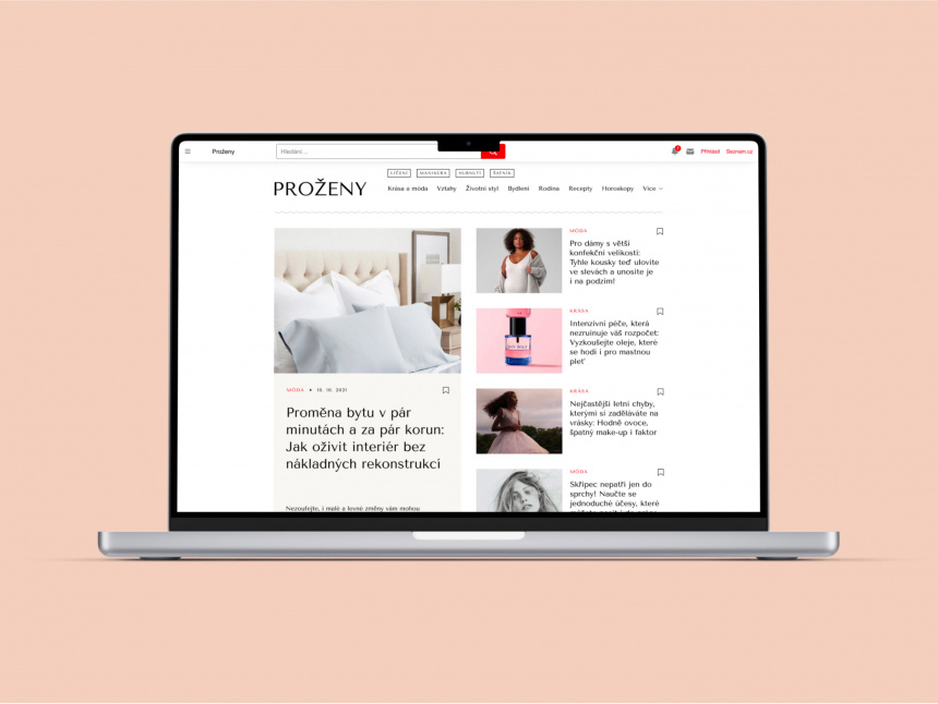
Proženy.cz Webdesign
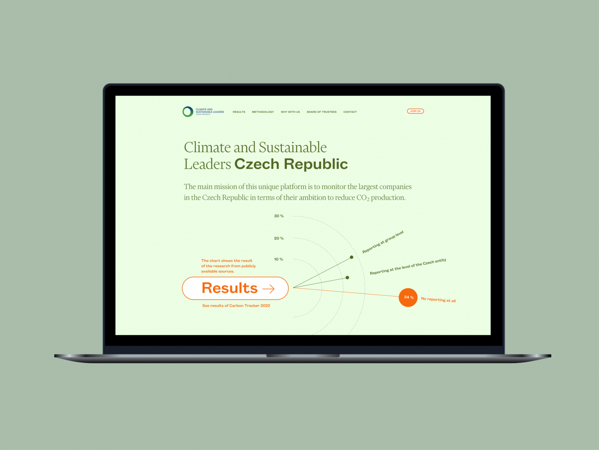
Climate and Sustainable Leaders Web design Our scalable design system fits the long-term mission of the unique platform, created to pursue the ambition of reducing CO₂ production by the largest companies in the Czech Republic. The platform aims to motivate key players in the Czech economy to launch projects that contribute to sustainability and climate protection, and to assist with their implementation. We've designed this system to ensure consistent brand experiences across all touchpoints, facilitating cross-functional collaboration for cohesive solutions. Data collection and reporting tools have been wrapped in a future-proof look, with interfaces designed to accommodate emerging technologies such as AI and VR/AR. This forward-thinking approach not only addresses current needs but also positions the platform to evolve with technological advancements, ensuring its long-term relevance and effectiveness in promoting sustainable practices.
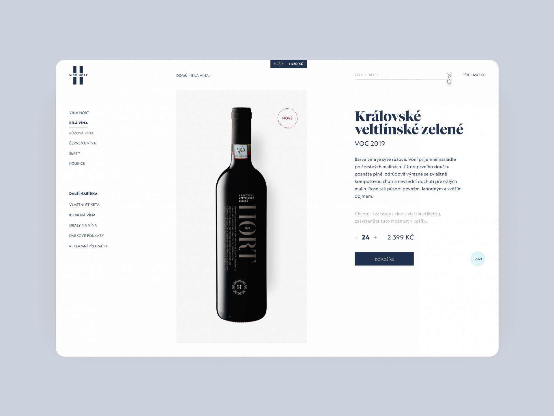
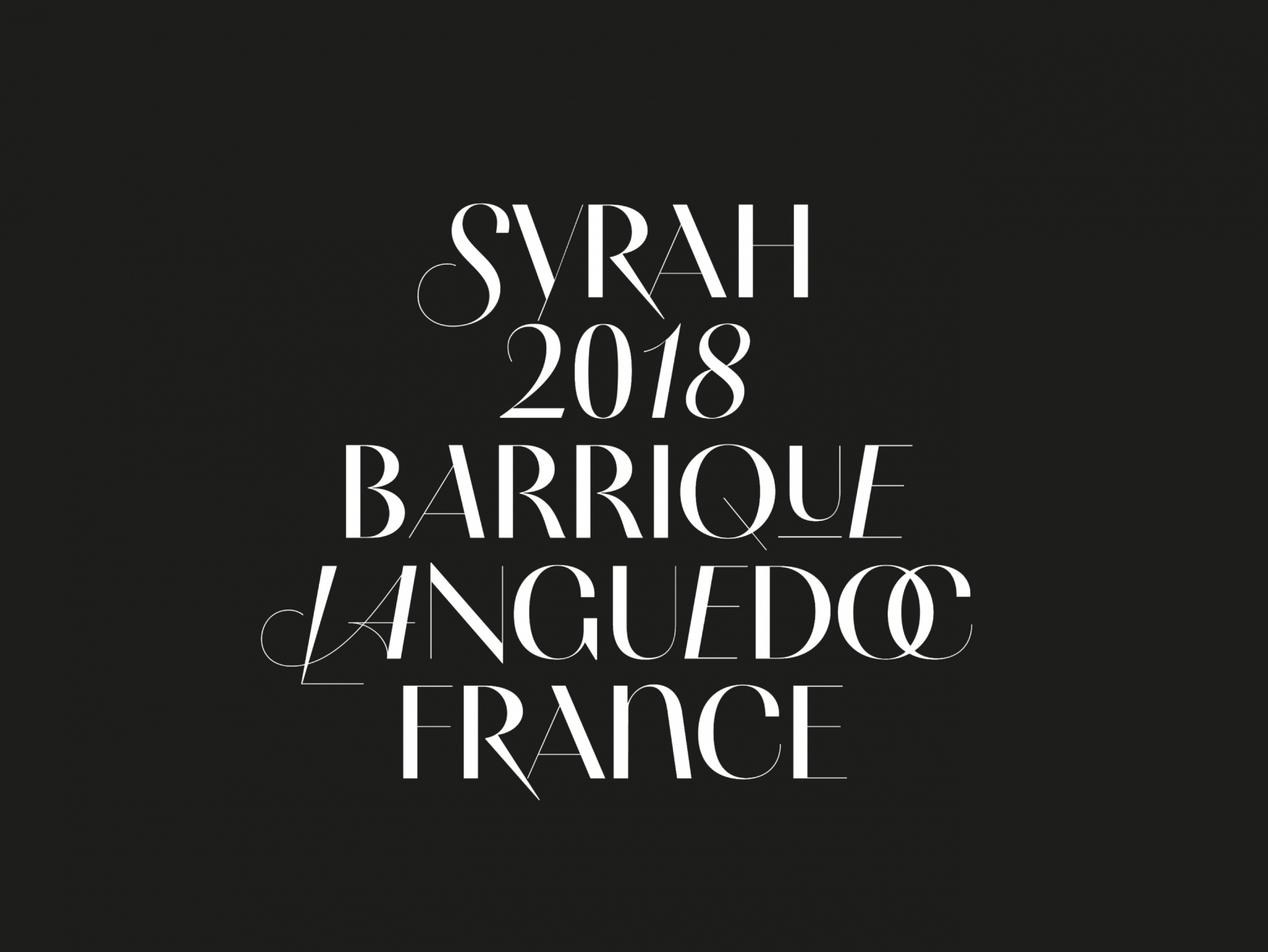
Vino Hort Visual Identity In a sophisticated concept based on typography with the aim of differentiation, supported by extensive research, we have managed to create a well-known brand and keep it in the awareness of lovers of quality wine. The unmistakable visual style predominantly accentuates the name of the founder and owner of the brand, while also managing to work with a range of limited editions and complementary beverages.

FinBricks Visual identity & Website A new open banking aggregation platform that gives an access to a wide range of financial data and banking products has been presented with a simple bricks kit logotype, isometric demonstrative illustrations and simplified colour schemes.
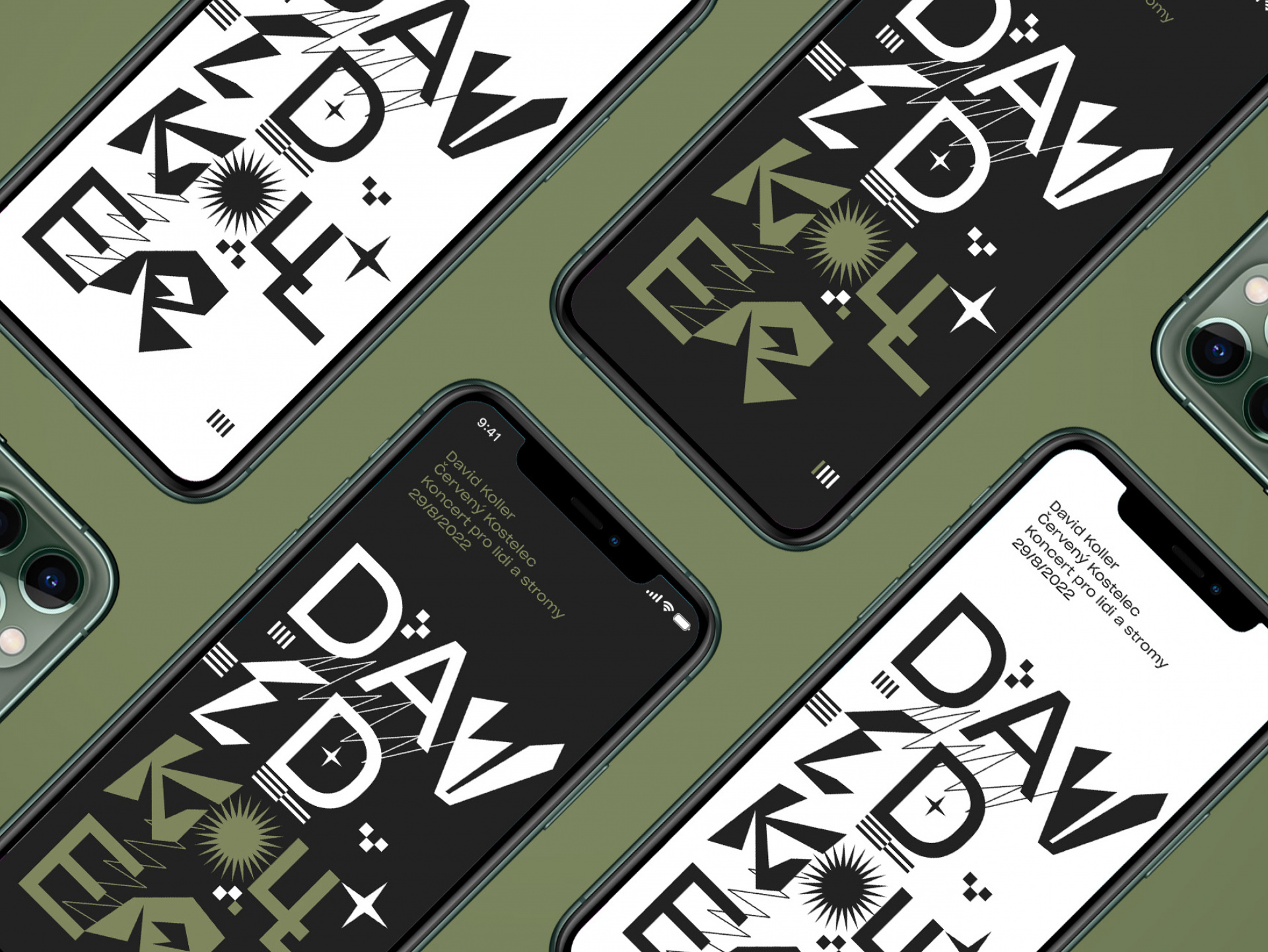
David Koller #-# Tour promotion
Good design catches the eye, sparks excitement, clarifies goals, and offers simple solutions. It turns brand values into real experiences for customers.
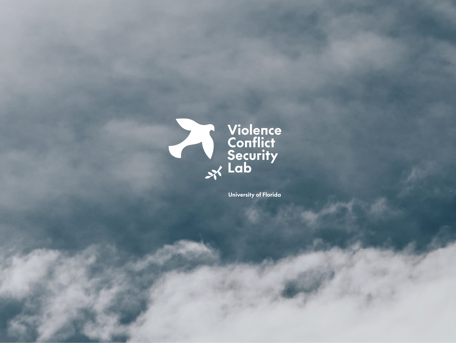
University of Florida Branding A new logotype for The ViCS Lab which stands at the forefront of research on violence, conflict, and security. Loss of peace means conflict.
Cleverlance IT Magazine A corporate publication that soared to 1st place in the Phoenix competition's B2C category (2021) and triumphed again in the B2B category (2022), also clinching the Phoenix special award for design. Tasked with creating a corporate #IT magazine on the themes of mobility and planetary transformation, we produced several issues that culminated in a stunning physical printed magazine, alongside its digital counterpart, featuring full content, layout preparation, selection of fonts and images, original illustrations, and pre-press preparation.
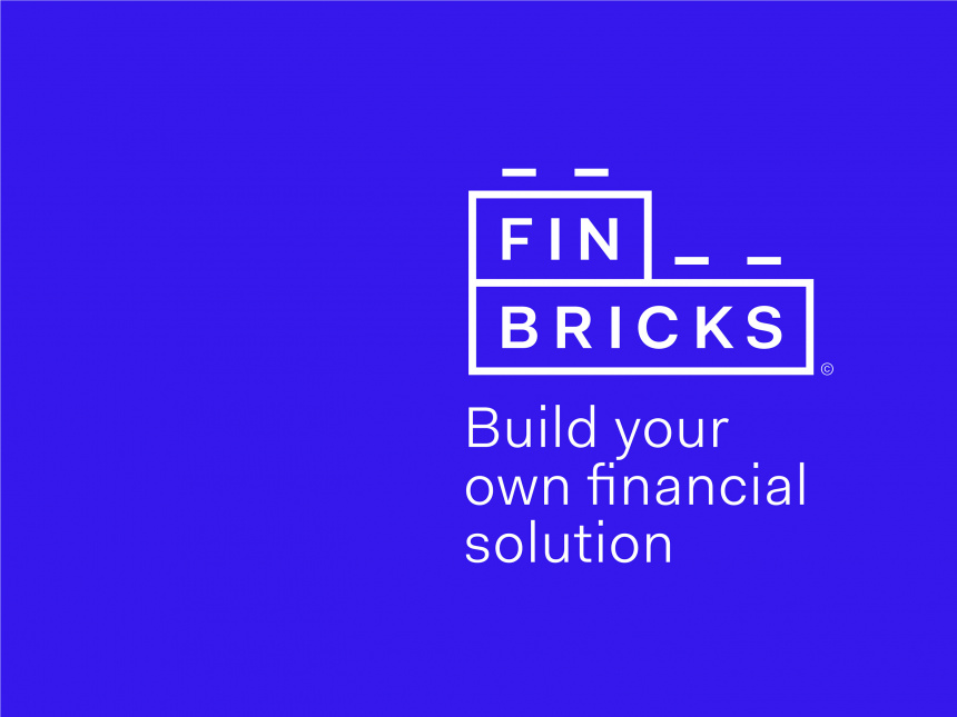
Finbrics Visual identity & Website A new open banking aggregation platform that gives an access to a wide range of financial data and banking products has been presented with a simple bricks kit logotype, isometric demonstrative illustrations and simplified colour schemes.
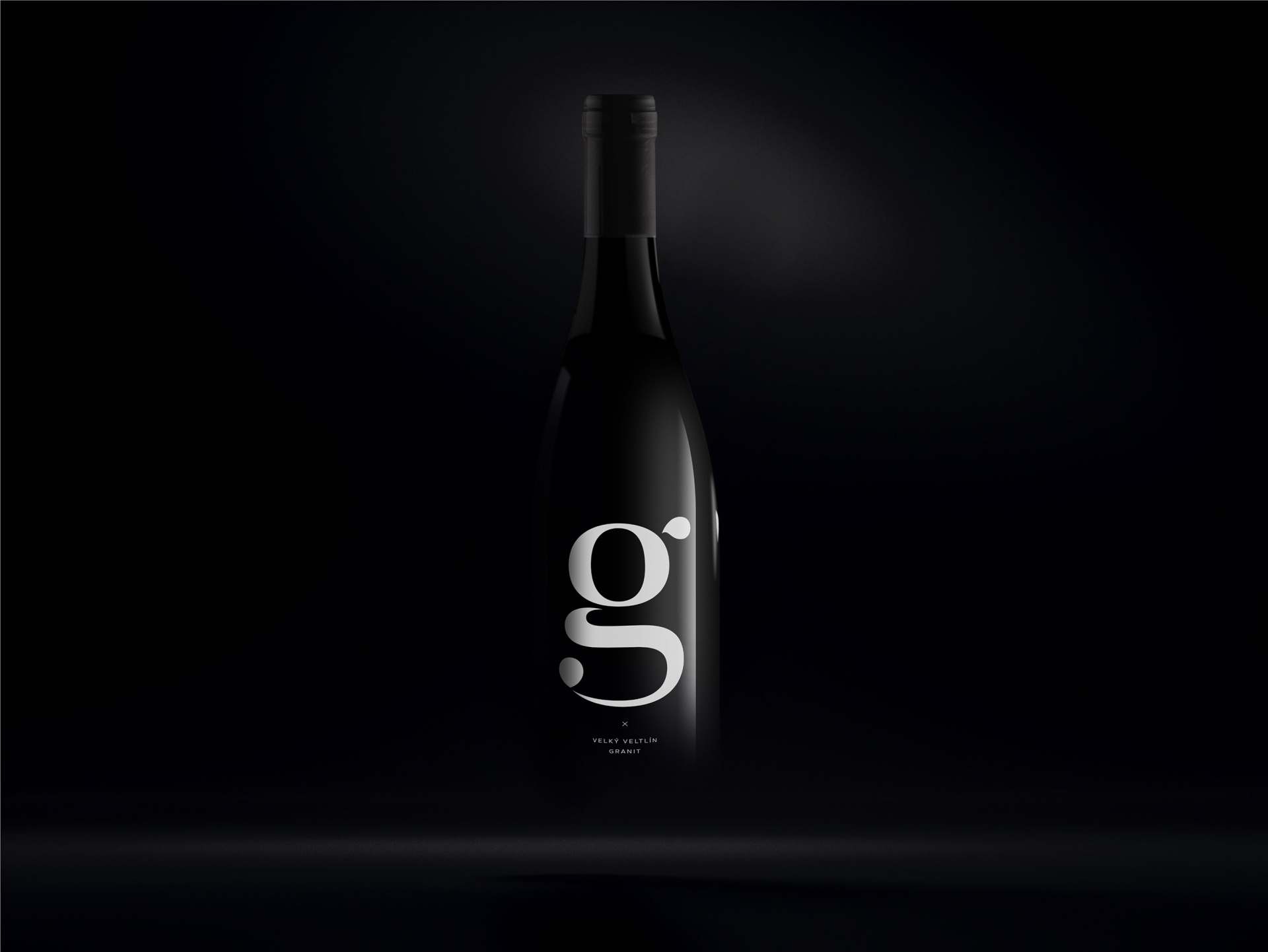
Vino Hort Visual Identity In a sophisticated concept based on typography with the aim of differentiation, supported by extensive research, we have managed to create a well-known brand and keep it in the awareness of lovers of quality wine. The unmistakable visual style predominantly accentuates the name of the founder and owner of the brand, while also managing to work with a range of limited editions and complementary beverages.
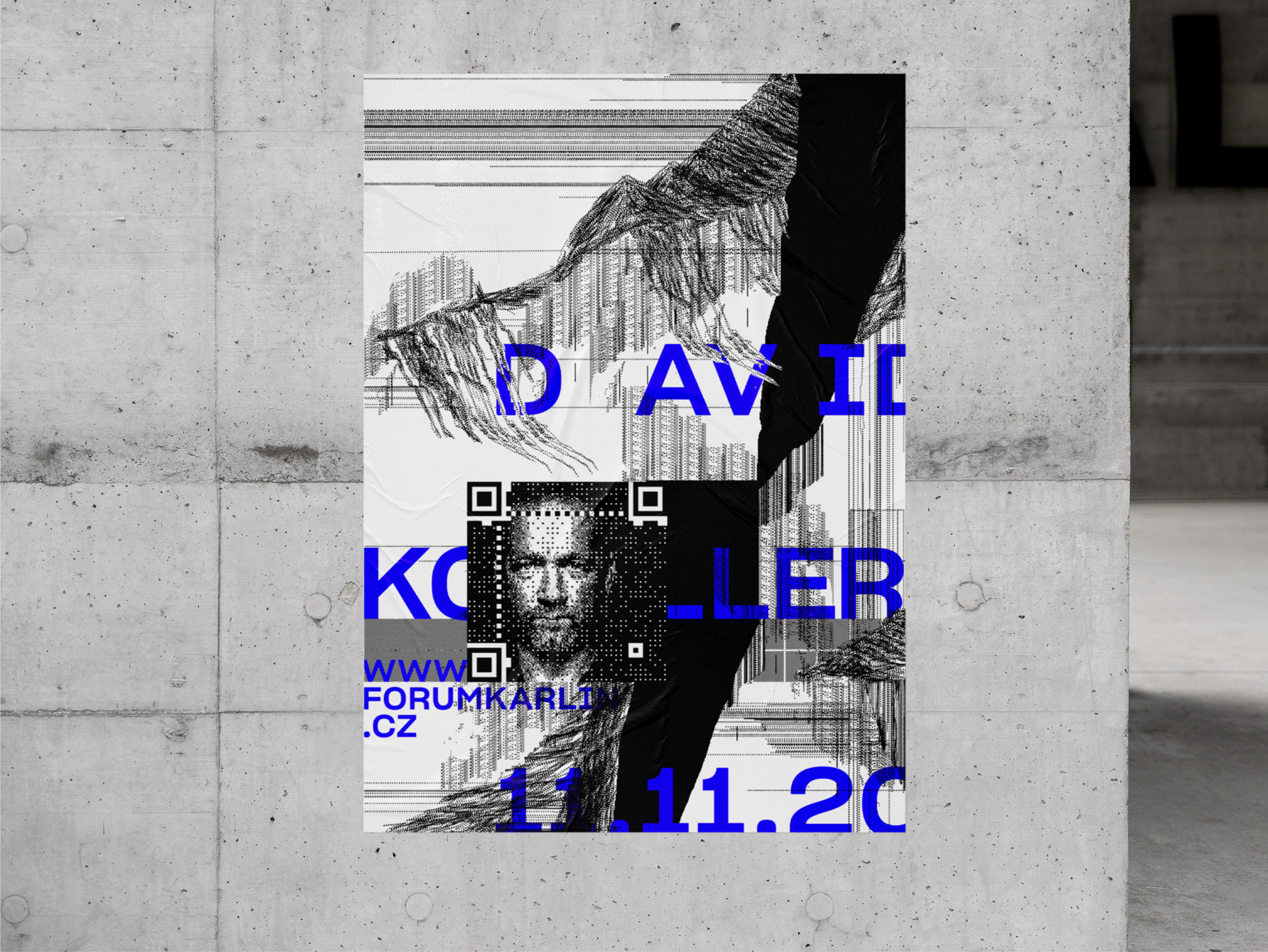
David Koller Poster In harmony with David Koller’s evolving sound, we crafted a vivid visual ecosystem for his new album. Our designs spanned the CD cover, posters, banners, merchandise, and beyond, capturing his shift towards a more electronic resonance. Collaborating with the renowned Czech artist David Černý, we portrayed the band's frontman through a QR code portrait, merging art with technology in a striking blend. The result is a captivating visual system, where the QR code’s pixel structure meets pixel-shaped brush strokes, blending classical drawing techniques with modern digital artistry.
CDN sun Web & Identity For a smaller local Content Delivery Network provider we redesigned their visual identity, updated entire logotype and boosted typography to look more of a global sized company.
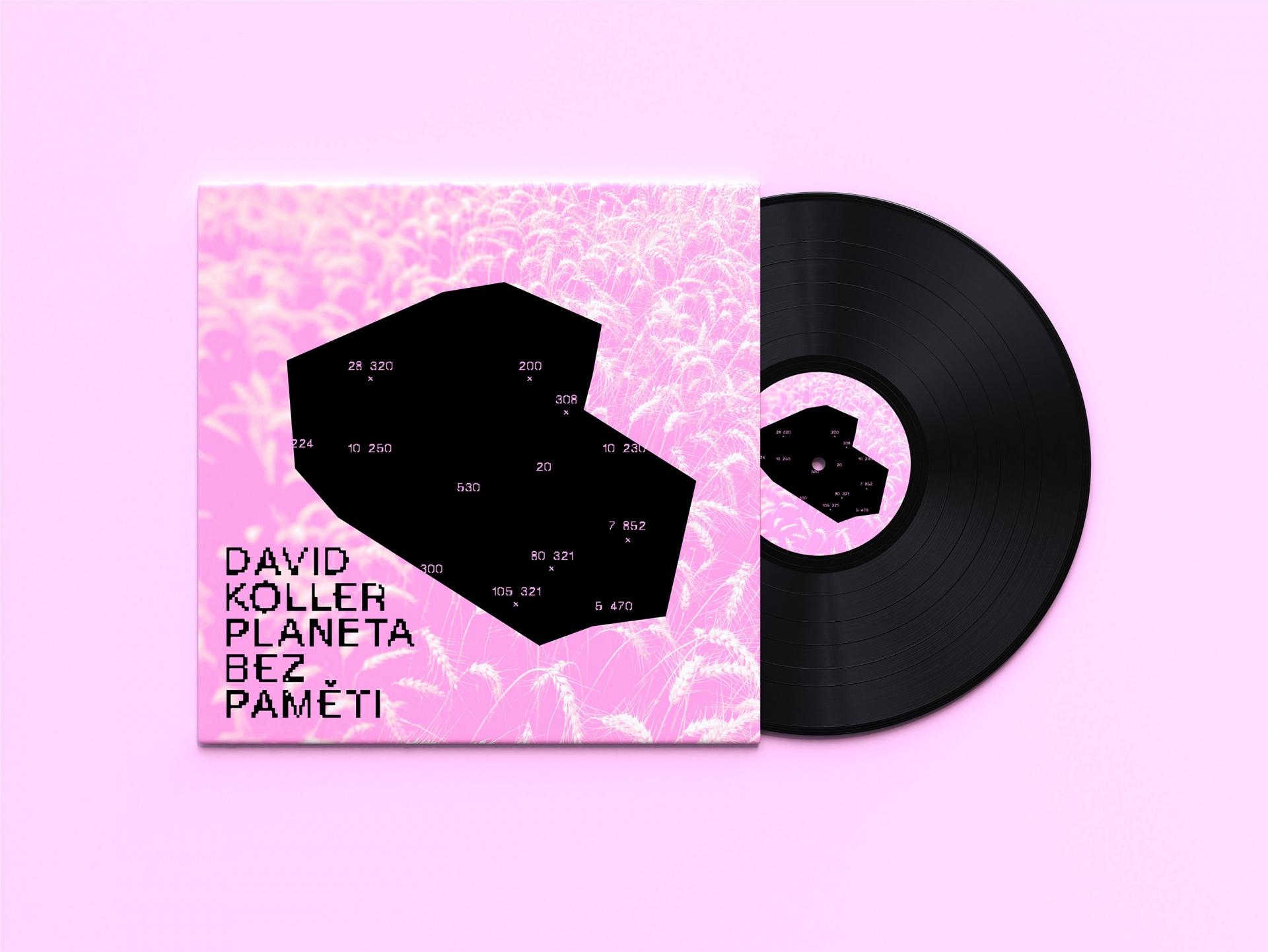
David Koller Cover The musical single Planet Without Memory, produced by Czech singer David Koller, dealt with the situation surrounding the covid pandemic and, in the words of renowned writer Jáchym Topol, drew attention to the callousness of the masses of people and their indifference to death. Our contrast colour design sticked to the theme and burst its tension and appeal.
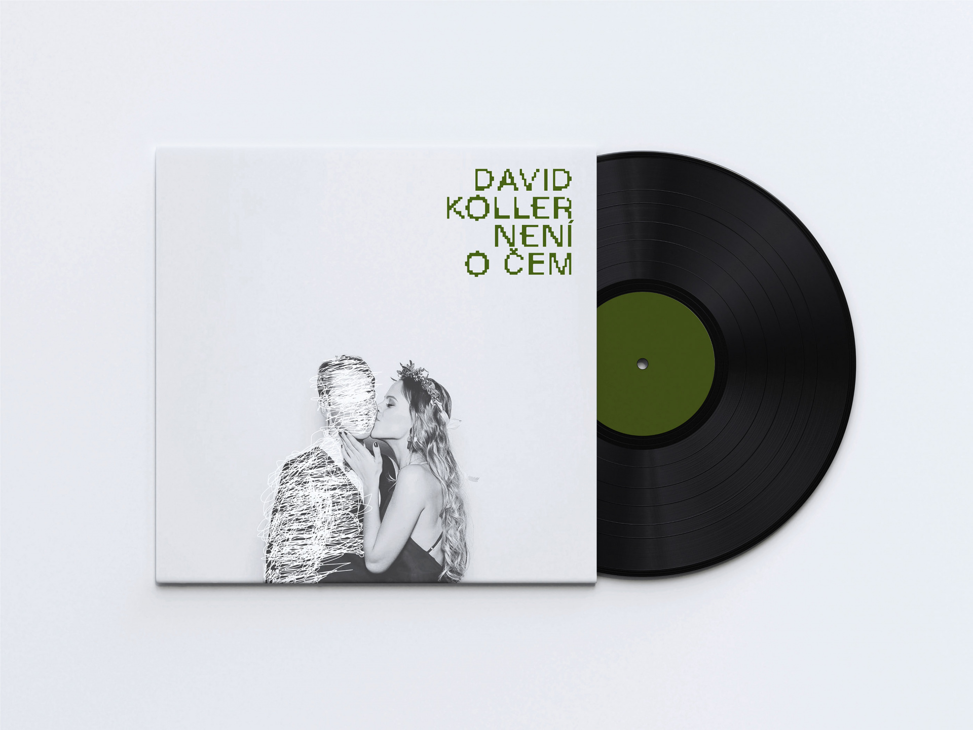
David Koller Cover Another single from David Koller reflected on epiphany, sobriety, alienation and abandonment in partner relationships. We portrayed these feelings as the disappearing figure of one of the couple, including a goodbye kiss. No drama, that's life and music about it.
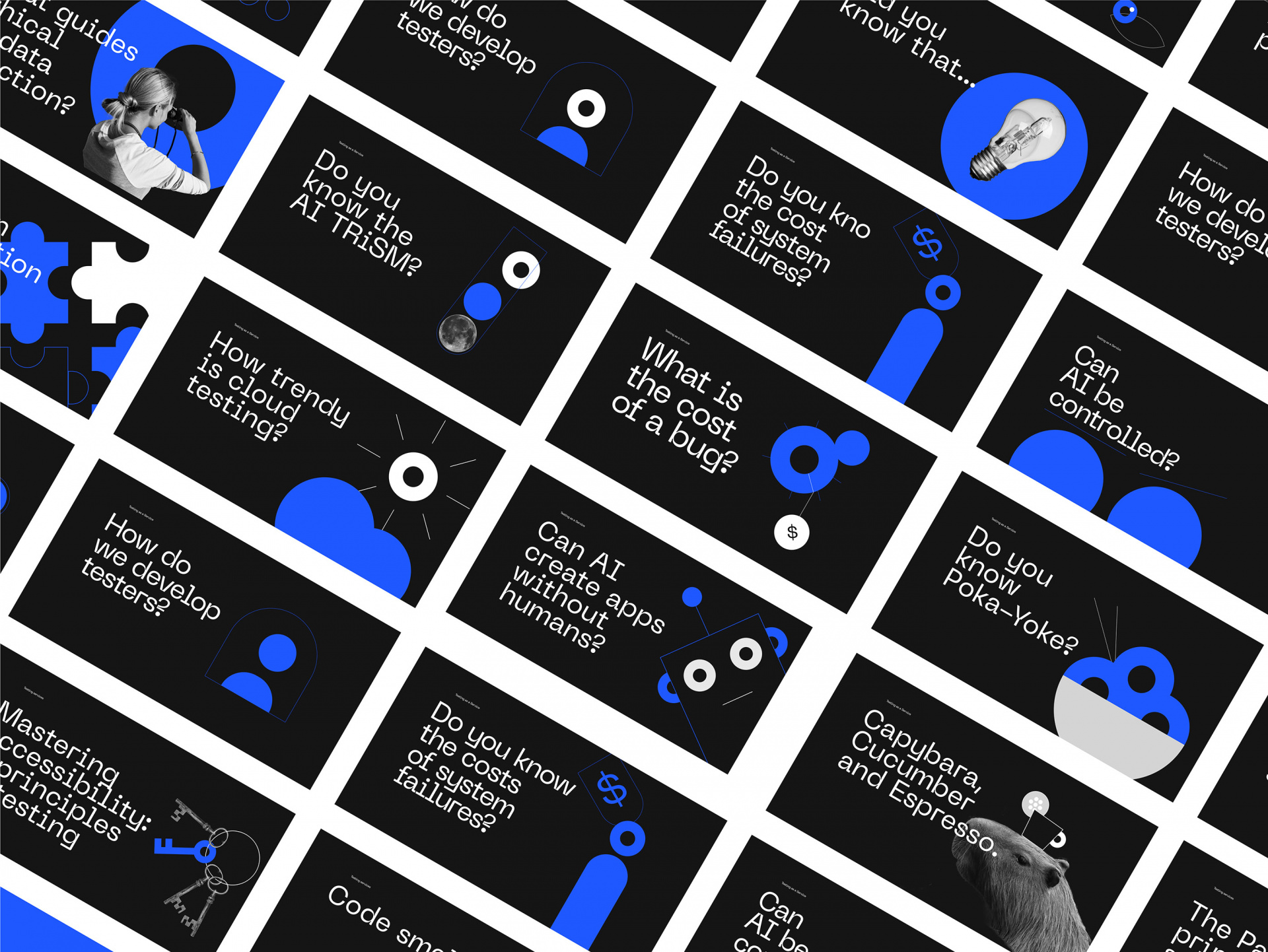
Cleverlance Campaign There was a need to establish a distinctive visual style to promote the Testing as a Service competences and core values with the goal of increasing awareness of expertise for the Head of Testing and QA services, showcasing the team's capabilities, and ultimately attracting new clients. Additionally to graphic design and content we helped with defining campaign goals.
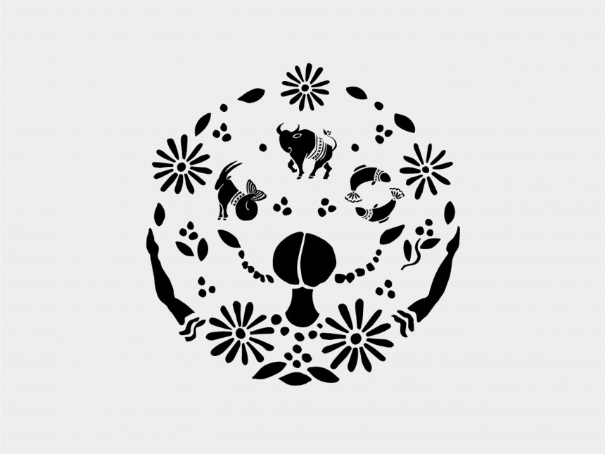
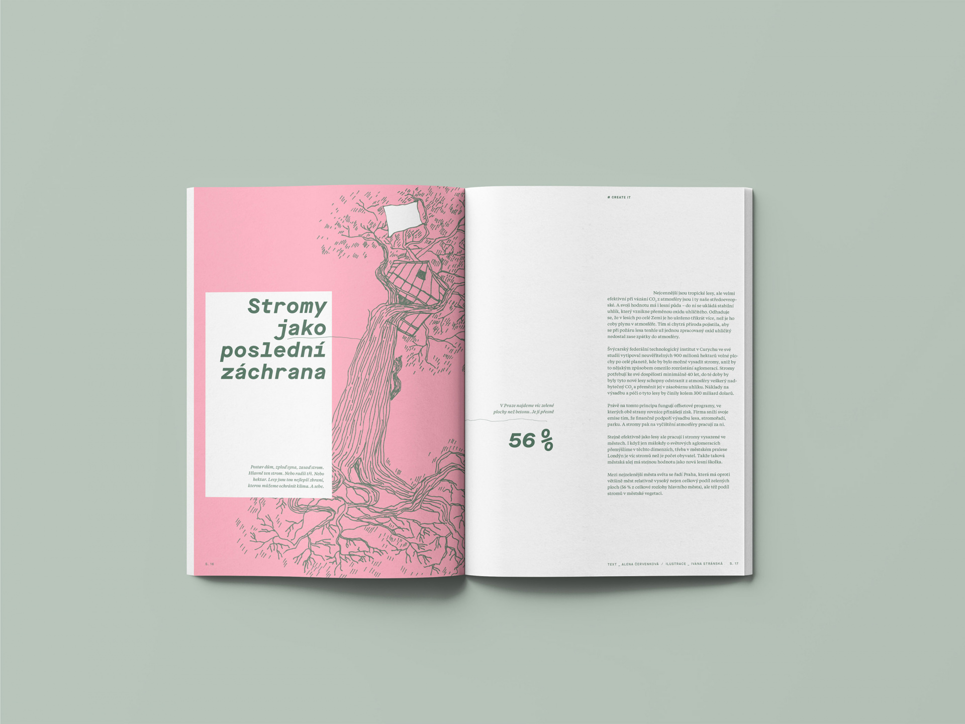
Proženy.cz Illustrations Illustrations of zodiac signs and section topics